REBOL/View VID Developer's Guide
This document describes VID, the Visual Interface Dialect for creating graphical user interfaces in REBOL 2.
Contents
Layout Concepts
Layout Structure
Simple Examples
Layout Function
Layout Refinements
Keywords
Face Styles
Predefined Styles
Facets
Custom Styles
Style Facets
Text Facets
Size Facets
Color Facets
Image Facets
Action Facets
Character Facets
Face Facet Blocks
Attribute Keywords
Size Keyword
Offset Keyword
Origin Keyword
Auto-Layout Direction
Below Keyword
Across Keyword
Return Keyword
Spacing
Space Keyword
Pad Keyword
Indent Keyword
Aligning Faces
At Keyword
Tabs Keyword
Tab Keyword
Guide Keyword
Style Definition [rev]
Custom Styles
Styles in Layouts
Creating Stylesheets
Style Keyword
Styles Keyword
Other Keywords
Do Keyword
Variables
Position Variables
Face Variables
Avoiding Variable Collisions
Layout Dialect Keywords
Layout Organization
Layout Attributes
Offset
Size
Origin
Space
Below
Across
Tabs
Guides
Positioning and Spacing
At
Pad
Indent
Tab
Return
Style Definition
Style
Styles
Other Keywords
Do
Facets
View Facets
VID Extensions
Edge Facet
Font Facet
Para Facet
Feel Facet
Effect Facet
Scaling
Tiling
Subimages
Translation
Image Processing
Gradients
Keys
Algorithmic Shapes
Introduction
By their nature, graphical user interfaces (GUI) are more descriptive than they are functional. In REBOL, the Visual Interface Dialect (VID) provides an efficient method of describing GUIs. VID is implemented as a layer that rides on top of the REBOL/View graphical compositing system. VID provides shortcut expressions that are automatically translated into View objects and functions. You can seamlessly combine VID and View code and data for great power and flexibility.
Layout Concepts
A VID layout is a block of words and values that is used to describe a GUI. It provides the names, attributes, and operations that are used to display text areas, buttons, checkboxes, input fields, slider bars, and more. The format of the VID layout block is organized according to the rules of VID.
Layout Structure
A layout block consists of:
| Keywords | Layout keywords that describe face positioning and other layout attributes. |
| Styles | Face styles that are used to specify the faces that are displayed. These can be predefined styles like TITLE, BUTTON, FIELD, TEXT, or your own custom styles. |
| Facets | Attributes that describe variations in the style of a face, such as the size, color, alignment, border, or image. |
| Variables | Definitions that hold either faces or layout positions. These variables can be used later to access face objects or to affect face positions. |
| Styledefs | New style definitions that are to be used within the layout. Single styles or entire stylesheets can be provided. |
These elements can be mixed and matched in whatever order is necessary to create a layout.
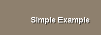
Simple Examples
The easiest way to learn VID layouts is by example. The single line below creates and displays a window that contains the obligatory "Hello World!" example:
view layout [title "Hello World!"]
The layout block contains the VID description of what to display. The block is a dialect, not normal REBOL, and it is passed to the LAYOUT function to create the faces for the layout. The result of the LAYOUT function is passed to the VIEW function to display it on your screen:
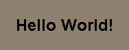
The TITLE word is a predefined style and is followed by values and attributes that affect that style. In the example above, a string value provides the title text.
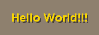
VID provides more than 40 predefined styles. For example, you can replace the TITLE style with the video BANNER style:
view layout [banner "Hello World!!!"]
The result becomes:
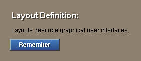
Within a layout, multiple styles can be provided. Each style creates another element of the interface. The example below shows a video heading (vh2), followed by text, then by a button:
view layout [
    vh2 "Layout Definition:"
    text "Layouts describe graphical user interfaces."
    button "Remember"
]
This example would appear as:
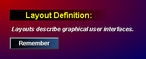
Thousands of effects and variations are possible within a layout by specifying style attributes called facets. These attributes follow the style word. Here is an example that shows how an elaborate layout can be created in a few lines of VID code:
view layout [
    backdrop effect [gradient 1x1 180.0.0 0.0.100]
    vh2 "Layout Definition:" 200x22 yellow
        effect [gradmul 1x0 50.50.50 128.128.128]
    vtext bold italic "Layouts describe graphical user interfaces."
    button "Remember" effect [gradient 0.0.0]
]
The result would be:
Layouts can specify as many faces as your interface requires. For example, this layout uses styles, a backdrop, a heading, text labels, text input fields, and buttons:
view layout [
    style lab label 100 right
    across
    vh2 "Provide Your Information:" gold return
    lab "User Name:" field return
    lab "Email Address:" field return
    lab "Date/Time:" field form now return
    lab "Files:" text-list data load %. return
    lab
    button 96 "Save"
    button 96 "Cancel"
    return
]
This layout creates:
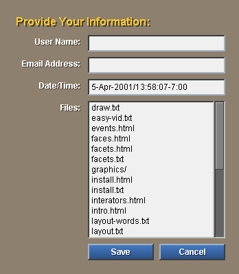
The example shows how multiple styles can be specified within a layout.
Layout Function
The LAYOUT function takes a layout block as an argument and returns a layout face as a result. The block describes the layout according to the rules of the Visual Interface Dialect. The block is evaluated and a face is returned.
The result of LAYOUT is can be passed directly to the VIEW function, but it can also be set to a variable or returned as the result of a function. The line:
view layout block
can also be written as:
window: layout block
view window
The result of the layout function is a face and can be used in other layouts. More on this later.
Layout Refinements
In most cases, the LAYOUT function is called without refinements; however, these refinements are available when necessary:
| /size | A PAIR! that specifies the size of the resulting face. This forces the face to be of a fixed size before the layout is performed. The default is to size the face dynamically based on the placement of items within the layout. |
| /offset | A PAIR! that provides the offset to where the window will be displayed within its parent face (often the screen). |
| /styles | A stylesheet block that was created with the STYLIZE function. A stylesheet defines custom styles used within the layout. This is equivalent to the STYLES keyword within a layout. |
| /origin | A PAIR! that sets the pixel offset to the first face within the layout. This is equivalent to the ORIGIN keyword within a layout. |
| /parent | Specifies the style of the top-level face that is produced from the layout. The parent can be specified as a style name or as an actual instance of the style. |
| /options | Specifies the VIEW options when the face is displayed with the VIEW function. See the VIEW function for details. |
Keywords
Here is a summary of the layout keywords that describe face positioning and other layout attributes. These are reserved words. These words cannot be used for style names or for variables within a layout.
| across | Set auto-layout to horizontal direction. |
| at | Locate a face to an absolute position. |
| backcolor | Set the color of the background. |
| below | Set auto-layout to vertical direction. |
| do | Evaluate a block. |
| guide | Set a guide line. |
| indent | Indent horizontally. |
| offset | Set the output face position. |
| origin | Specify the layout starting position. |
| pad | Insert extra spacing. |
| return | Return to the current guide position. |
| style | Define a custom style. |
| styles | Use styles from a stylesheet. |
| space | Set the auto-spacing used between faces. |
| size | Set the output face size. |
| tabs | Set tab stops. |
| tab | Advance to next tab position. |
Each of these keywords is described in more detail in sections of this document.
Face Styles
Face styles are used to specify the faces that are displayed. These can be predefined styles, or they can be your own custom styles.
Predefined Styles
Predefined styles are part of VID and can be used in three ways.
- You can use any predefined style as-is and it will provide its default look and feel.
- You can specify variations on a style by providing facets such as color, size, font, effects, etc.
- You can use a style as the basis for defining a new custom style.
The predefined styles are listed below. For more information about each of these styles, refer to the Styles chapter (a separate document).
| title | Document title heading. |
| h1 | Top level heading used for documents. |
| h2 | Heading use for document sections. |
| h3 | Heading used for subsections. |
| h4 | Heading used below subsections. |
| h5 | Heading used below subsections. |
| banner | Title heading with video style. |
| vh1 | Section heading used for video style. |
| vh2 | Section heading used for video style. |
| vh3 | Section heading used for video style. |
| text | Document body text. |
| txt | An alias for TEXT style above. |
| vtext | Inverse video body text. |
| tt | The teletype font for fixed width text. |
| code | Same as TT except defaults to bold. |
| label | Used for specifying GUI text labels. |
| field | Text entry field. |
| info | Same as FIELD style, but read-only. |
| area | Text editing area for paragraph entry. |
| sensor | An invisible face that senses mouse events. |
| image | Display a JPEG, BMP, PNG, or GIF image. |
| box | A shortcut for drawing a rectangular box. |
| backdrop | Scale an image over the entire layout window. |
| backtile | Tile an image over the entire layout window. |
| icon | Display a thumbnail sized image with text caption. |
| led | An indicator light. |
| anim | Display an animated image. |
| button | A button that goes down on a click. |
| toggle | Similar to BUTTON but has a dual state. |
| rotary | Similar to BUTTON but allows multiple states. |
| choice | A pop-up button that displays multiple choices. |
| check | A check box. |
| radio | A rounded radio button. |
| arrow | An arrow button with a beveled edge. |
| progress | A sliding progress bar. |
| slider | A slider bar. |
| panel | A sub-layout. |
| list | An iterated sub-layout. |
| text-list | A simple form of the LIST style. |
| key | Keyboard shortcut. |
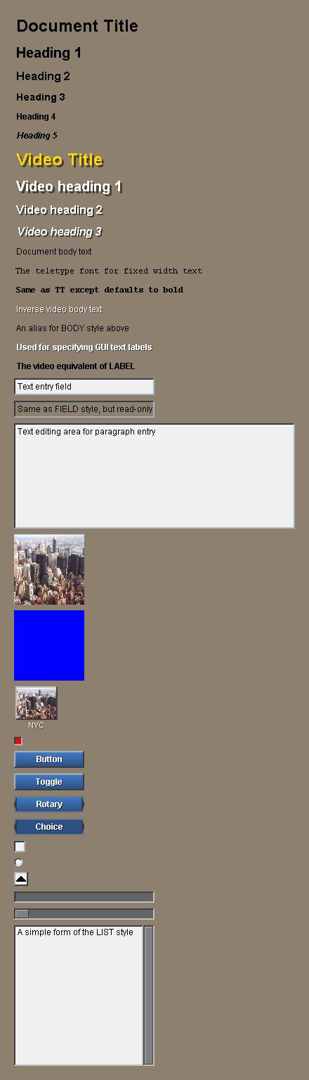
Here is an example that shows most of these custom styles:
title "Document Title"
h1 "Heading 1"
h2 "Heading 2"
h3 "Heading 3"
h4 "Heading 4"
h5 "Heading 5"
banner "Video Title"
vh1 "Video heading 1"
vh2 "Video heading 2"
vh3 "Video heading 3"
text "Document body text"
tt "The teletype font for fixed width text"
code "Same as TT except defaults to bold"
vtext "Inverse video body text"
txt "An alias for BODY style above"
label "Used for specifying GUI text labels"
lbl "The video equivalent of LABEL"
field "Text entry field"
info "Same as FIELD style, but read-only"
area "Text editing area for paragraph entry"
do [if not exists? %nyc.jpg [write/binary %nyc.jpg read/binary %../nyc.jpg]]
image %nyc.jpg 100x100
box blue
icon %nyc.jpg "NYC"
led
button "Button"
toggle "Toggle"
rotary "Rotary"
choice "Choice"
check
radio
arrow
progress
slider 200x16
text-list "A simple form of the LIST style"
This will appear as:
Facets
All of the styles above can be provided with additional information to vary their size, color, text, alignment, background, and more. This is described in detail in the Facets section below.
Custom Styles
Any of the styles listed above can be used as the base style for creating your own custom style. This is covered in the Style Definition section later in this document.
Style Facets
Within a layout, each face is specified by a style word that identifies the look and feel of the face. Each style word can be followed by optional facet attributes that further modify the face. Facets can control the text, size, color, images, actions, and most other aspects of a face.
All facets are optional. For example, the example below shows how you can create a button with a variety of facets. The facets can be provided alone or in combination.
button
button "Easy"
button "Easy" 40x40
button "Easy" oldrab
button "Easy" [print "Fun"]
button "Easy" 40x40 maroon [print "Fun"]
The resulting face looks like:
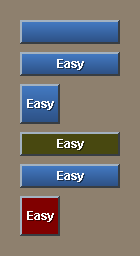
Facets can appear in any order. You don't need to keep track of which goes first. All of these mean the same thing:
button "Easy" 40x40 navy [print "Fun"]
button navy "Easy" 40x40 [print "Fun"]
button 40x40 navy "Easy" [print "Fun"]
button [print "Fun"] navy 40x40 "Easy"
They produce:
Text Facets
Text string facets provide the text used for all faces. The text can be written as a short string in quotes, a long multiline string in braces, or provided as a variable or function that contains the string.
text "Example string"
text {This is a long, multilined textsection that is put in a braced
string and will be displayed on the page.}

text text-doc

text read %file.txt
For some faces styles, more than one string can be provided. For instance, a choice button accepts multiple strings:
choice "Steak" "Eggs" "Salad"
Size Facets
The size of a face can be specified as a pair that provides the width and height of the face in pixels:
image %nyc.jpg 100x200
text "example" 200x200
button "test" 50x24
The width of a face can also be expressed an integer, leaving the height to be computed automatically:
text "example" 200
button "test" 50
Color Facets
A color is written as a tuple that provides the red, green, and blue components of the color.
image %nyc.jpg 250.250.0
text "example" 0.0.200
button "test" 100.0.0
The are also about 40 predefined colors in REBOL that can be used:
text red "Warning"
text blue "Cool down"
text green / 2 "Ok"
Notice in the last case how the color can be reduced by dividing it by two.
Some faces accept multiple colors. For instance:
toggle "Test" red green

rotary "Stop" red "Caution" yellow "Go" green
Image Facets
An image can be provided as a filename, a URL, or as image data.
image %nyc.jpg
image http://data.rebol.com/view/nyc.jpg
button "Test" %nyc.jpg
An image can also be loaded and used as a variable:
town: %nyc.jpg

image town
image 30x30 town
icon town "NYC"
Action Facets
An action is specified as a block. The action makes a face "hot". When a user clicks on the face, the block will be evaluated.
image %nyc.jpg [print "hello"]
text "example" [print "there"]
button "Test" [print "user"]
Some styles accept a second block that is used as an alternate action (right-click action). For example:
text "Click Here" [print "left click"] [print "right click"]
Character Facets
A shortcut key is written as a character (a string with a # before it). If the user presses a shortcut key, the action block will be evaluated as if the user clicked on it.
image %nyc.jpg #"i" [print "hello"]
text "example" #"^t" [print "there"]
button "Test" #" " [print "user"]
Face Facet Blocks
Note that facet blocks are most useful when used in conjunction with custom styles.
| font | A font block is used to specify other details about a font, such as its font name, point size, color, shadow, alignment, spacing, and more: |
text "black" font [color: 255.255.255 size: 16 shadow: none]
| para | A para block specifies the paragraph attributes of a text face. This is where you adjust the spacing between paragraphs, margins, and other values. |
text "test" para [origin: 10x10 margin: 10x10]
| edge | An edge block gives you a way to control the edge around the outside of a face. You can set its color, size, and effect. |
image %nyc.jpg edge [size 5x5 color: 100.100.100 effect: [bevel]]
| effect | An effect block specifies special graphic effects for a face. Many effects are possible, such as gradients, colorize, flip, rotate, crop, multiply, contrast, tint, brighten, and various combinations. |
image %nyc.jpg effect [contrast 20]
image %nyc.jpg effect [tint 120 brighten 30]
button "Test" effect [gradient 0x1 200.0.0]
| with | The with block allows you to specify any other type of face characteristic using standard REBOL object format. |
Attribute Keywords
These words control the layout as it is being created. They affect the placement of faces within the layout.
Size Keyword
SIZE sets the size of the layout face. This must be done at the beginning of a layout before any styles are used. For example, the simple layout:
size 200x100
h2 "Size Example"
would appear as:
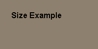
This is equivalent to the /size refinement in the LAYOUT function. If no size is specified, then the layout is auto-sized based on the styles used within it.
Offset Keyword
OFFSET specifies the position of the layout face within its parent face (often the screen). This is the same as the /offset refinement in the LAYOUT function.
offset 10x32
The offset need not be specified in the layout. It can be specified in the View if necessary. The default offset is 25x25.
Origin Keyword
ORIGIN sets the starting X and Y position of faces in the layout. The origin is specified as the number of pixels from the upper left corner of the layout window. However, the origin also determines the amount of spacing between the last face and the bottom right of the layout. The default origin is 20x20.
The example below uses an origin that is smaller than usual:
origin 4x2
text bold "Origin at 4x2"
It creates a display like this:

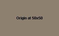
If an integer is specified for the origin, then both the X and Y positions will be set to that value, as in this example:
origin 50
text bold "Origin at 50x50"
The example above produces:
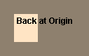
When no pair value is provided, the origin word returns the layout to its original origin position.
box 34x40 beige
origin
text bold "Back at Origin"
Here the text will overlay the box that was created at the origin:
As you can see from the above examples, the origin also has an affect on the size of the resulting face when no size has been provided.
Setting the origin is especially important when creating panels and lists. Frequently the origin in lists is set to zero. For example:
vh2 "Films:"
list 144x60 [
    origin 0
    across
    text 60
    text 80
] data [
    ["Back to the Future" "1:45"]
    ["Independence Day" "1:55"]
    ["Contact" "2:15"]
]
would produce:
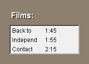
The block provided to the LIST style is a layout with an origin of zero.
Auto-Layout Direction
Below Keyword
BELOW specifies a vertical layout for faces that follow it. It is used along with ACROSS for auto layout of faces.
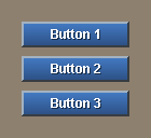
BELOW is the default layout direction when none is specified. For example:
button "Button 1"
button "Button 2"
button "Button 3"
looks like:
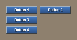
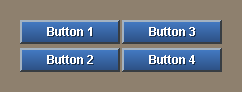
You can switch between BELOW and ACROSS at any time during a layout. When BELOW is used, faces will be positioned below the current face. The example:
across
button "Button 1"
button "Button 2"
return
below
button "Button 3"
button "Button 4"
produces:
Across Keyword
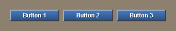
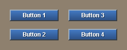
ACROSS specifies a horizontal layout for faces that follow it. It is used along with BELOW for auto layout of faces.
When ACROSS is used, faces will be located to the right of the current face. The example:
across
button "Button 1"
button "Button 2"
button "Button 3"
creates:
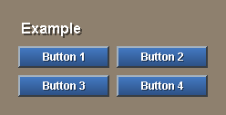
You can switch between ACROSS and BELOW at any time during a layout.
vh2 "Example"
across
button "Button 1"
button "Button 2"
return
button "Button 3"
button "Button 4"
return
The above example would display:
Return Keyword
RETURN advances the position to the next row or column, depending on the layout direction. If the layout direction is across, return will start a new row. If the direction is below, return will start a new column.
The example:
across
text "Name:" 100x24 right
field "Your name"
return
text "Address:" 100x24 right
field "Your address"
return
Produces:
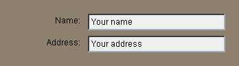
The position of the column is relative to the origin or to a guide.
Spacing
Space Keyword
SPACE sets the auto-spacing to use between faces within the layout. The spacing can be changed at any time within your layout. Either a pair or an integer can be given. If you specify a pair, both the vertical and horizontal spacing is set.
Compare these two cases. The first specifies a small space:
space 2x4
button "Button 1"
button "Button 2"
return
button "Button 3"
button "Button 4"
and produces:
The second uses a larger space:
space 20x16
button "Button 1"
button "Button 2"
return
button "Button 3"
button "Button 4"
that results in:
If the space you specify is an integer, only the spacing in the current direction (across or below) is set. The line would look like:
space 5
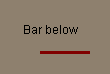
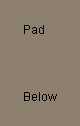
Pad Keyword
PAD inserts extra spacing between the current position and the position of the next face. The distance can be specified as an integer or a pair. When it is a pair, the space will be added both horizontal and vertically.
text "Bar below"
pad 20x4
box 50x3 maroon
When the PAD is an integer, space is either vertical or horizontal depending on the current direction of auto layout (determined by below and across words).
A PAD used in a BELOW:
below
text "Pad"
pad 40
text "Below"
has a vertical effect:
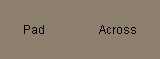
and a PAD used in an across:
across
text "Pad"
pad 40
text "Across"
has a horizontal effect:
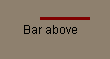
Note that negative pad values are also allowed.
text "Bar above"
pad 20x-30
box 50x3 maroon
The bar is now above the text:
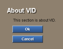
Indent Keyword
INDENT inserts spacing horizontally between the current position and the next face. It is not affected by the auto layout direction.
This example indents 20 pixels for every face after the heading:
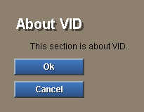
vh1 "About VID"
indent 20
text "This section is about VID."
button "Ok"
button "Cancel"
The result is:
Negative values can also be used:
vh1 "About VID"
indent 20
text "This section is about VID."
indent -20
button "Ok"
button "Cancel"
Aligning Faces
At Keyword
AT sets an absolute layout position for the face that follows it. Here's a simple example that sets the next position of a layout:
at 60x30
vh2 "Simple Example"
that looks like:
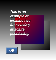
Here is an example that places multiple faces on top of each other:
at 0x0
backdrop effect [gradient 0x1 gray]
at 70x70
box effect [gradient 1x1]
at 50x50
box effect [gradient 1x1 200.0.0 0.0.100]
at 30x30
vtext bold italic 100 {This is an example of locating
    two faces using absolute positioning.}
at 20x160
button 40 "OK"
The result would be:
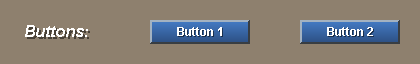
Tabs Keyword
TABS specifies the tab spacing that is used when a TAB word is encountered. The direction of the tab (horizontally or vertically) depends on the current direction of the layout as specified by BELOW and ACROSS.
To set the tab spacing an integer provides regular spacing of that amount:
across
tabs 150
vh3 "Buttons:"
tab
button "Button 1"
tab
button "Button 2"
The result is:
Fixed tab positions can also be provided with a block of integers. In this example two tab-stops are defined to align the result:
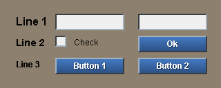
across
tabs [80 200]
h2 "Line 1"
tab field 100
tab field 100
return
h3 "Line 2"
tab check
text "Check"
tab button "Ok"
return
h4 "Line 3"
tab button "Button 1"
tab button "Button 2"
This produces:
Note that tabs also apply vertically and tabs can be changed at any time in a layout. For example:
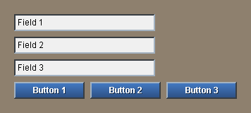
tabs 40
field "Field 1"
field "Field 2"
field "Field 3"
return
across
tabs 100
button "Button 1"
button "Button 2"
button "Button 3"
displays:
Tab Keyword
TAB skips forward in the current direction (across or below) to the next tab position. Tabs positions are set with the TABS keyword. See the TABS description for more examples
The example:
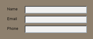
across
tabs 80
text "Name"  tab field return
text "Email" tab field return
text "Phone" tab field return
produces:
Guide Keyword
GUIDE sets the return margin for face layout. When the RETURN word is used, an invisible guide-line determines where the next face will be placed. Guides can be thought of as virtual borders that align the placement of faces. If the guide has not been set, it defaults to be the origin.
A guide can be created by specifying a position, or if no position is provided, then the current position will be used. This example shows a heading, then creates a guide for the remaining faces:
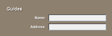
across
vh2 "Guides"
guide 60x100
label "Name:" 100x24 right
field
return
label "Address:" 100x24 right
field
return
This example creates:
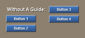
Here is a good example of a problem that is solved by a guide. The layout below creates an undesired effect:
vh2 "Without A Guide:"
button "Button 1"
button "Button 2"
return
button "Button 3"
button "Button 4"
that is shown here:
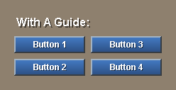
If a GUIDE is added after the heading:
vh2 "With A Guide:"
guide
button "Button 1"
button "Button 2"
return
button "Button 3"
button "Button 4"
the buttons will be aligned:
Style Definition [rev]
Custom Styles
You can define your own styles. This is useful if you use a style with the same facets multiple times in your layout. Defining your own style will make it easier to write and easier to modify your script later.
For instance, the code:
text black 200x24 bold "This"
text black 200x24 bold "is"
text black 200x24 bold "an"
text black 200x24 bold "example"
would be easier to write if a new style called txt where defined:
txt "This"
txt "is"
txt "an"
txt "example"
The new style can be created in two ways. Styles can be defined in a layout, or they can be created in a stylesheet and applied to a layout.
Styles in Layouts
To create a style that is defined only within a layout, use the style keyword. In this example, the txt style is created:
style txt text black 200x24 bold
txt "This"
txt "is"
txt "an"
txt "example"
The style word is followed by the new style name, a base style to begin with, and a set of facets that modify it. Any facets can be supplied as part of the style, including text, images, and action.
The txt style is only valid within the layout block. It can be used within the block or within any subpanels or lists created by the block. However, if you attempt to use the style outside the block an error will occur.
Any number of custom styles can be added to the layout block.
Creating Stylesheets
To create custom styles for multiple layouts, you will need to create a stylesheet with the stylize function.
new-styles: stylize [
    txt: text black 200x24 bold
    btn: button 80x24 effect [gradient 0x1 0.80.0]
    fld: field 100x24
]
Each new style is written as a set word followed by a base style and list of facets.
To use the stylesheet within a layout, include it with a styles keyword:
view layout [
    styles new-styles
    txt "Text"
    btn "Button"
    fld "Field"
]
A layout can contain any number of styles from any combination of stylesheets and styles.
Style Keyword
STYLE defines a new style that is local to the current layout. The format of the style begins with the new style name and is followed by a normal layout face specification.
style blue-text text blue center 200
Once a style has been defined, it can be used just like any other style:
blue-text "Blue Text Here"
It is common to define a new button style in a layout:
style btn button 80x22 leaf

btn "Test" [print "Test button pressed"]
btn "This" [print "This button pressed"]
Predefined styles can be redefined with the STYLE word. For example, this line will redefine the BUTTON style used within a layout:
style button button green 120x30
Such changes are local to the layout and do not affect the button style used in other layouts.
Styles Keyword
STYLES allows you to use a predefined stylesheet in one or more layouts. When a stylesheet is provided, those styles become available to the layout.
A stylesheet is created with the STYLIZE function. Styles are defined similar to a layout, but with the new style name appearing as a variable definition.
big-styles: stylize [
    btn: button 300x40 navy maroon font-size 16
    fld: field 300x40 bold font-size 16 middle center
    lab: text 300x32 font-size 20 center middle red black
]
The new styles and their names are encapsulated within the stylesheet and can be used in any layout.
styles big-styles
lab "Enter CPU Serial Number:"
fld "#000-0000"
lab "Press to Eject CPU:"
btn "Eject Now"
btn "Cancel"
Any number of stylesheets can be used within a layout.
Other Keywords
Do Keyword
DO evaluates an expression during the process of making a layout.
h2 "Introduction:"
do [
    intro: either exists? %intro.txt [read %intro.txt]["NA"]
]
txt intro
Note that the DO is only evaluated once; when the layout is created. It is not evaluated when the layout face is shown.
Variables
Position Variables
When creating a layout, you will sometimes need to know the position of a face on the page. To do this, a position variable can be set before any layout keyword.
For instance, a convenient way to get the current position is with the AT word. If you provide it with no new position, it will simply set a variable to the current position:
here: at
The variable here will hold the current position.
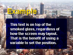
This can be useful if you need to use a position later in your layout. You may want to lay one face on top of another. Here is an example that places text on top of a transparent box:
backdrop %nyc.jpg
banner "Example"
here: at
box 200x100 effect [multiply 60]
at here + 10x10
vtext bold 200x100 - 20x20 {
   This text is on top of the smoked
   glass, regardless of how the screen
   may layout.  That is the benefit of
   using a variable to set the position.
}
Face Variables
Some of the faces that you use in a layout will need to be changed when the page is being displayed. For instance, the action of a button may trigger a change in text or images that are displayed.
To obtain the face that was created with a style, set a variable just before the style word. For example, here the variable name will refer to the text face that is created:
name: text "Merlot" 100x30
At another point on the page the text can be changed with a button that modifies the face's contents:
button "Change" [name/text: "Cabernet" show name]
When the button is pressed, the text field of the name face will be changed to "Cabernet". The show function is then used to update the face in the window so the change can be seen.
Avoiding Variable Collisions
For large scripts that have a lot of position and face variables, it may become difficult to manage all of the names and keep them from interfering with each other. A simple solution to this problem is to define pages within objects that have the required variables defined locally to the objects. For instance here is an address book form that keeps all of its variables local:
make object! [
    title-name: name: email: phone: none
    num: 1
    page1: layout [
        title-name: title "Person 1:"
        box 200x3 red
        across
        text "Name"  tab name: field return
        text "Email" tab email: field return
        text "Phone" tab phone: field return
        button "Send" [
            send luke@rebol.com [
                "Person " num newline
                name email phone newline
            ]
            num: num + 1
            title-name/text: reform [Person num]
            clear name/text
            clear email/text
            clear phone/text
            show [title-name name email phone]
        ]
    ]
]
Be sure to add any new variables to the object definition.
Layout Dialect Keywords
Layout Organization
As described in previous documents (soon), the layout dialect consists of:
- Layout keywords that describe face positioning and other layout attributes (see below).
- Face styles that are used to specify the faces that are displayed. These can be predefined styles (see Predefined Styles document) or custom styles.
- Variable definitions that hold either faces or layout positions. These variables can be used later to access face objects or to affect face positions.
- New style definitions that are to be used within the layout. Single styles or entire stylesheets can be provided.
This document will describe the layout keywords.
Note that all layout keywords are optional and most keywords can be used multiple times.
Layout Attributes
These words control the layout as it is being created. They affect the placement of faces within the layout.
Offset
OFFSET specifies the position of the layout face within its parent face (often the screen). (NA prior to Link 0.4.35)
offset 10x32
The offset need not be specified in the layout. It can be specified in the View if necessary. The default offset is 25x25.
Size
SIZE sets the size of the layout face. This must be done at the beginning of a layout before any styles are used.
size 800x600
If no size is specified, then the layout is auto-sized based on the styles used within it.
Origin
ORIGIN sets the starting position of faces in the layout. The origin is specified as the number of pixels from the upper left corner of the layout window. The default origin is 20x20.
origin 100x100
text "Origin at 100x100"
If an integer is specified, then both the X and Y positions will be set to that value:
origin 100
text "Origin at 100x100"
The origin can also be used within a layout to return the layout to the origin position.
origin
text "Back at the origin"
The origin value also determines the amount of spacing between the last face and the bottom right of the layout.
Setting the origin is especially important when creating panels and lists. Frequently the origin in lists is set to zero:
list 400x80 [
    origin 0
    across
    txt 100
    txt 200
] data [
    ["Bobbie" "Smith"]
    ["Barbie" "Jones"]
    ["Bettie" "Rebol"]
]
Space
SPACE sets the auto-spacing to use between faces within the layout. The spacing can be changed at any time within your layout. Either a pair or an integer can be given. If you specify a pair, both the vertical and horizontal spacing is set.
space 5x8
If you specify an integer, only the spacing in the current direction (across or below) is set.
space 5
Below
BELOW sets the direction of the layout to be vertical for faces that follow it. That is, the next face will be positioned below the current face. This can be changed at any time during a layout.
below
button "Yes"
button "No"
button "Cancel"
BELOW is the default layout direction.
Across
ACROSS sets the direction of the layout to be horizontal for faces that follow it. That is, the next face will be position to the right of the current face. This can be changed at any time during a layout.
across
button "Yes"
button "No"
button "Cancel"
Tabs
TABS specifies the tab spacing that is used when a TAB word is encountered. The direction of the tab (horizontally or vertically) depends on the current direction of the layout as specified by BELOW and ACROSS.
To set the tab spacing an integer provides regular spacing of that amount:
tabs 160
Fixed tab positions can also be provided with a block of integers:
tabs [120 280 440 620]
Tabs can be changed at any time in a layout.
Guides
GUIDE sets the return margin for face layout. When the RETURN word is used, the GUIDE will determine where the next face will be placed. They can be thought of as virtual borders that align the placement of faces.
A guide can be created by specifying a position, or if no position is provided, then the current position will be used.
across
guide 100x100
txt "Name:" 100x24 right
field
return
txt "Address:" 100x24 right
field
return
Positioning and Spacing
These words affect the positioning of faces that follow them. Both absolute and relative positioning are supported.
At
AT sets an absolute layout position for the face that follows it.
at 100x100
image %face.jpg
With AT you can change the next position of the layout or even place multiple faces on top of each other:
at 100x100
box 200x200 navy
at 110x110
text "This text is on top of the box face." 180
Pad
PAD inserts extra spacing between the current position and the position of the next face. The distance can be specified as an integer or a pair. When it is a pair, the space will be added both horizontal and vertically.
text "Image Below"
pad 10x20
image %photo.jpg
When the PAD is given an integer, space is either vertical or horizontal depending on the current direction of auto layout (determined by below and across words).
below
txt "Word"
pad 40
txt "Here"

across
txt "Word"
pad 40
txt "Here"
Indent
INDENT inserts spacing horizontally between the current position and the next face. It is not affected by the auto layout direction.
title "About VID"
indent 20
body "This section is about VID."
Tab
TAB skips forward in the current direction (across or below) to the next tab position. Tabs positions are set with the TABS keyword.
across
tabs 68
text "Name"  tab field return
text "Email" tab field return
text "Phone" tab field return
Return
RETURN advances the position to the next row or column, depending on the layout direction. If the layout direction is across, return will start a new row. If the direction is below, return will start a new column.
across
txt "Name:" 100x24 right
field "Your name"
return
txt "Address:" 100x24 right
field "Your address"
return
The position of the column is relative to the origin or to a guide.
Style Definition
Style
STYLE defines a new style that is local to the current layout. The format of the style begins with the new style name and is followed by a normal layout face specification.
style blue-text text blue center 200
Once a style has been defined, it can be used just like any other style:
blue-text "Blue Text Here"
It is common to define a new button style in a layout:
style btn button 80x22 leaf

btn "Test" [print "Test button pressed"]
btn "This" [print "This button pressed"]
Predefined styles can be redefined with the STYLE word. For example, this line will redefine the BUTTON style used within a layout:
style button button green 120x30
Such changes are local to the layout and do not affect the button style used in other layouts.
Styles
STYLES allows you to use a predefined stylesheet in one or more layouts. When a stylesheet is provided, those styles become available to the layout.
A stylesheet is created with the STYLIZE function. Styles are defined similar to a layout, but with the new style name appearing as a variable definition.
big-styles: stylize [
    btn: button 300x40 navy maroon font-size 16
    fld: field 300x40 bold font-size 16 middle center
    lab: txt 300x32 font-size 20 center middle red black
]
The new styles and their names are encapsulated within the stylesheet and can be used in any layout.
styles big-styles
lab "Enter CPU Serial Number:"
fld "#000-0000"
lab "Press to Eject CPU:"
btn "Eject Now"
btn "Cancel"
Any number of stylesheets can be used within a layout.
Other Keywords
Do
DO evaluates an expression during the process of making a layout.
h2 "Introduction:"
do [
    intro: either exists? %intro.txt [read %intro.txt]["NA"]
]
txt intro
Note that the DO is only evaluated once; when the layout is created. It is not evaluated when the layout face is shown.
Facets
Facets are attributes of a face. Facets include the face's location, size, color, image, font, style, paragraph format, rendering effects, behavior functions, and other details. Some facets are objects themselves, allowing the sharing of attributes several faces.
View Facets
These are the primary facets used by the View display system to show faces. These facets can be inherited from the SYSTEM/view/face object which is also defined globally as the FACE object.
| offset | An X-Y PAIR that specifies the horizontal and vertical position of the face. If a face is outside it's parent face it will be clipped. Defaults to 0x0. |
| size | An X-Y PAIR that specifies the width and height of the face. Defaults to 100x100. |
| span | An optional X-Y PAIR that specify the range of a virtual coordinate system to use for the face. This can be used to create resolution independent displays. Normally this is set to NONE. |
| pane | A face or block of sub-faces that are to be displayed within the face. This allows you to create faces that contain faces to any degree. |
| text | The text contents of a face. The attributes of the text are determined by the FONT and PARA facets. Any printable value can be used. |
| data | Used by VID for storing other information about the face. Outside of VID this field can be freely used by programs. |
| color | The color of the face, specified as a TUPLE. When set to NONE the face is transparent. Default value is 128.128.128. |
| image | An IMAGE to use for the face's body. This must be an IMAGE value not a file name. A wide range of image processing effects can be performed on the image with the EFFECT field. |
| effect | A WORD or BLOCK that renders image processing effects on the face image or background. More than one effect can be used at the same time. |
| edge | An OBJECT that specifies the edge of the face. It can include the color, size, and effects used for the edge. |
| font | An OBJECT that specifies the font used for the text. This includes the font name, style, size, color, offset, space, align, and other attributes. |
| para | An OBJECT that describes the paragraph characteristics of the text. It includes the origin, margin, indent, tabs, edit, wrap, and scrolling attributes. |
| feel | An OBJECT that holds the functions that define the behavior of the face. These functions are evaluated during the rendering, selection, and hovering over a face and during events related to the face. |
| rate | An INTEGER or TIME that specifies the rate of time events for a face. This is used for animation or repetitive events (such as holding the mouse down on certain types of user interface styles). An INTEGER indicates the number of events per second. A TIME provides the period between events. |
| options | A BLOCK of optional flags for the face. These are normally used by a top-level view face. Options include NO-TITLE, RESIZE, NO-BORDER, ALL-OVER. |
| saved-area | Enables faster rendering for transparent faces. When a face is transparent on a static (unchanging) backdrop, this field can be set to TRUE to accelerate redrawing. The face can change without requiring the backdrop to be rendered each time. The pixels for the area under the face will be saved into this field, changing it from a TRUE to an IMAGE. This field defaults to NONE. |
| line-list | A BLOCK that is used to track the offsets of text lines when text is being displayed. When more than 200 characters of text are being displayed, this list should be set to NONE when large changes are made to the text. This allows REBOL to recalculate the locations of all TEXT lines. |
VID Extensions
VID extends the face definition to include these additional facets. Faces that are created with the LAYOUT or MAKE-FACE functions will include these facets in addition to those described above.
| colors | A BLOCK of alternate colors used for the face. For example, this field would hold the colors for a button that changes colors on being selected. |
| texts | A BLOCK of alternate text used for the face. For example, buttons that display different text on selection would store that text here. |
| effects | A BLOCK of alternate effects used for a face. For example, a BUTTON style may use a different effect when it is in the down position. |
| action | A BLOCK or FUNCTION that is evaluated when the face has been selected. The type of event that triggers this action depends on the style of the face. |
| alt-action | An alternate BLOCK or FUNCTION that is evaluated on an alternate selection of the face. |
| keycode | A CHAR or BLOCK of shortcut keys for the face. When pressed, these keys will evaluate the ACTION field. |
| state | The event state of buttons. Indicates that the button is still being pressed. |
| dirty? | A LOGIC flag that indicates that the text of the face has been modified. Whenever editing is performed upon a text face, this flag will be set to TRUE. |
| help | An optional string that can be used for displaying information about a button or other type of GUI element. For example, when the mouse pointer hovers over a face, this string can be displayed as help information. |
| file | The FILE path or URL of the image file used for the face. The image file is automatically loaded and cached by VID. |
| style | The style WORD that was used to create the face. For example: BUTTON, FIELD, IMAGE, RADIO, etc. |
| user-data | A field that is available to programs for storing data related to the face. This field is not used by the VID system. |
Edge Facet
The EDGE facet is an object that describes a rectangular frame that borders a face. It is used for creating image frames, button edges, table cell dividers, and other border effects. An edge is specified as an sub-object within the face object.
An EDGE object contains these fields:
| color | The color of the edge specified as a TUPLE. |
| size | An X-Y PAIR that specifies the thickness of the edge. The x value refers to the thickness of the vertical edges on the left and right, and the Y value refers to the horizontal edges at the top and bottom. |
| effect | A WORD or BLOCK that describes the effect to use for the edge. Edge effects include BEVEL, IBEVEL, BEZEL, IBEZEL, and NUBS. |
Font Facet
The FONT facet is an object that describes the attributes of the text to be used within a face. The font is specified as an sub-object within the face object.
The FONT object contains these fields:
| name | The name of the font to use for the text. There are three predefined variables for machine independent fonts that have a similar appearance: font-serif (times-like), font-sans-serif (helvetica-like), and font-fixed (courier fixed width). To create machine independent programs, avoid specifying custom fonts. The default is font-sans-serif. |
| size | An INTEGER that specifies the point size of the font. The default size is 12. |
| style | A WORD or BLOCK of words that describe the style of the text. Choices are: BOLD, ITALIC, and UNDERLINE. When set to NONE no styles are used (default). |
| color | A TUPLE that specifies the color of the text. The default color is black (0.0.0). |
| align | A WORD that provides the alignment of the text within the face. Choices are: LEFT, RIGHT, and CENTER. |
| valign | A WORD that indicates the vertical alignment of the text within the face. Choices are: TOP, BOTTOM, and MIDDLE. |
| offset | A PAIR that specifies the offset of the text from the upper left corner of the face. The PARA facet object also has an effect on this offset. Default is 2x2. |
| space | A PAIR that specifies the spacing between characters and between lines. The x value affects the spacing between characters. The y value changes the spacing between lines. Positive values expand the text, negative values condense it. The default is 0x0. |
| shadow | A PAIR that specifies the direction and offset of the drop shadow to use for the text. Positive values project a shadow toward the lower right corner. Negative values project toward the upper left. The default is NONE. |
Para Facet
The PARA facet is an object that controls the formatting of text paragraphs within the face. A para is specified as a sub-object within a face object.
The PARA object contains these fields:
| origin | An X-Y PAIR that specifies the offset of the text from the upper left corner of a face. The default is 2x2. |
| margin | An X-Y PAIR that specifies the right-most and bottom limits of text display within the face. The position is relative to the bottom right corner of the face. The default is 2x2. |
| indent | An X-Y PAIR that specifies the offset of a the first line of a paragraph. The X value specifies the indentation used for the first line of the paragraph. Positive and negative values may be used. The Y value specifies the spacing between the end of the previous paragraph and the first line of the next paragraph. The Y value has no affect on the first paragraph. The default is 0x0. |
| scroll | An X-Y PAIR used for horizontal and vertical scrolling of text within a face. The scroll amount that modifies the offset of the text relative to the face. The origin and margin values are not affected. The default is 0x0. |
| tabs | An INTEGER or BLOCK of integers that provide the tab spacing used within a paragraph. An INTEGER value indicates a fixed tab size spaced at regular intervals across the text. A BLOCK of integers provides the precise horizontal offset positions of each TAB in order. The default is 40. |
| wrap? | A LOGIC value that indicates that automatic line wrapping should occur. When set to TRUE, text that exceeds the margin will be automatically wrapped to the origin. When set to FALSE, text will not be wrapped. |
Feel Facet
The FEEL facet controls face's behavior in response system events like redraw, mouse input, and keyboard input. The fields of the feel object are all functions that are called by the View system on specific events. A summary of these functions is provided below. See the Face Feeling chapter for details.
The FEEL object contains these fields:
| engage | The primary function called for the majority of events that occur within a face. The ENGAGE function is called when the mouse pointer is over it's face and either mouse button is pressed. The function will also be called if a mouse button has been pressed and the mouse is moved over the face. In addition, the function is called when time events occur, such as for animation or repetitive selection events. |
| over | This function is called when the mouse pointer passes over the face and no buttons are pressed. This allows code to capture hover events and provide user feedback by changing the appearance of the face. For example, hot text may change the color of the text as the mouse passes over it. This field is separate from ENGAGE because it is not used for most faces. Over actions can occur at a high frequency, so setting the OVER field to NONE allows the system to ignore it. |
| detect | This function is called each time any event passes through a face. This function can be used to process events that are directed toward any subface of the face. For example, the function is used by VID to process keyboard shortcuts. The DETECT function is normally used at the window face or screen face level. Note that the insert-event-func function should be used to trap screen-face global events. |
| redraw | This function is called immediately before a face is displayed. Defining this function allows a face to dynamically modify any of its facets prior to being displayed. When not being used, it is critical that this function be set to NONE to speed up the display. |
Effect Facet
The EFFECT facet can be set to a WORD or a BLOCK that describes image processing operations to be performed on the backdrop of a face. When a block is used, multiple effects can be specified, and they are applied in the order in which they appear within the block. A wide range of hundreds of effects can be produced.
Scaling
| fit | Scales an image to the size of the face, less the edge of the face if it exists. The image will be scaled both horizontally and vertically to fit within the face. |
| aspect | Similar to FIT, but preserves the perspective of the image. The image is not distorted. If the image does not span the entire face, the remaining portion will be filled with the face background color. |
| extend | Extends an image horizontally, vertically, or both. An image is stretched without affecting its scale. For instance, a button with rounded ends can be resized without affecting the dimensions of the rounded ends. This allows a single button bitmap to be reused over a wide variety of sizes. Two PAIRs are supplied as arguments. The first PAIR specifies the offset where the image should be extended. It can be horizontal, vertical, or both. The second PAIR specifies the number of pixels to extend in either or both directions. |
Tiling
| tile | Repeats the image over the entire face. This allows you to apply textures that span an entire face. The tile offset will be relative to the face. |
| tile-view | Similar to TILE, but the tile offset will be relative to the window face. |
Subimages
| clip | Clips an image to the size of the face. This is normally done when the image is larger than the face, and the remaining effects do not need to be performed on the entire bitmap. The CLIP can be done at anytime in the effect block. For instance a CLIP done before a FLIP will produce a different result than a CLIP done after a FLIP. |
| crop | Extracts a portion of an image. This effect takes two PAIRs: the offset into the image and the size of the area needed. This operation can be used to pick any part of an image to be displayed separately. It allows you to pan and zoom on images. |
Translation
| flip | Flips an image vertically, horizontally, or both. A PAIR is provided as an argument to specify the direction of the flip. The X specifies horizontal and the Y specifies vertical. |
| rotate | Rotates an image. An INTEGER specifies the number of degrees to rotate in the clockwise direction. (Currently only 0, 90, 180, and 270 degree rotations are supported.) |
| reflect | Reflects an image vertically, horizontally, or both. A PAIR is used to indicate the direction of reflection. The X value will reflect horizontally, and the Y value will reflect vertically. Negative and positive values specify which portion of the image is reflected. |
Image Processing
| invert | Inverts the RGB values of an image. (Inversion is in the RGB color space.) |
| luma | Lightens or darkens an image. An INTEGER specifies the degree of the effect. Positive values lighten the image and negative values darken the image. |
| contrast | Modifies the contrast of the image. An INTEGER specifies the degree of the effect. A positive value increases the contrast and a negative value reduces the contrast. |
| tint | Changes the tint of the image. An INTEGER specifies the color phase of the tint. |
| grayscale | Converts a color image to black and white. |
| colorize | Colors an image. A TUPLE specifies the COLOR. The image is automatically converted to grayscale before it is colorized. [???Note] in docs/view-guide.txt |
| multiply | Multiplies each RGB pixel of an image to produce interesting coloration. An INTEGER, TUPLE, or IMAGE can be specified. An INTEGER will multiply each color component of each pixel by that amount. A TUPLE will multiply each of the red, green, and blue components separately. An IMAGE will multiply the red, green, and blue components of an image, allowing you to apply textures to existing images. [???Note] in docs/view-guide.txt |
| difference | Computes a difference of RGB pixel values. This can be used to compare two images to detect differences between them. An IMAGE is provided as an argument. Each of its RGB pixel values will be subtracted from the face image. |
| blur | Blurs an image. This effect may be used multiple times to increase the effect. |
| sharpen | Sharpens an image. This effect may be used multiple times to increase the effect. |
| emboss | Applies an emboss effect to the image. |
Gradients
| gradient | Generates a color gradient. A PAIR and two color TUPLEs can be supplied as arguments (optional). The PAIR is used to determine the direction of the gradient. The X value of one specifies horizontal and a Y value of one specifies vertical. Both X and Y can be specified at the same time, producing a gradient in both directions. Negative values reverse the gradient in that direction. |
| gradcol | Colorizes an image to a gradient. Arguments are identical to GRADIENT. The image is colorized according to the colors of the gradient. |
| gradmul | Multiplies an image over a gradient. Arguments are identical to GRADIENT. The image is multiplied according to the colors of the gradient. |
Keys
| key | Creates a transparent image by keying. A TUPLE or INTEGER can specify a chroma or luma key effect. A TUPLE will cause all pixels of the same value to become transparent. An INTEGER will cause all pixels with lesser luma values to become transparent. |
| shadow | Creates a drop shadow on a keyed image. Accepts the same arguments as KEY, but in addition to a creating transparent image it generates a 50 percent drop shadow. |
Algorithmic Shapes
A few shapes can be algorithmically generated to reduce the need for images in some frequently used cases.
| arrow | Generate an arrow image. An optional TUPLE can be used to specify the color of the arrow, otherwise the edge color will be used. The arrow is proportional to the size of the face. The direction of the arrow can be altered with FLIP or ROTATE. |
| cross | Generate an X cross image. This is used for check boxes. An optional TUPLE can be used to specify the color of the cross, otherwise the edge color will be used. The cross is proportional to the size of the face. |
| oval | Generate a oval image. An optional TUPLE can be used to specify the color of outside of the oval, otherwise the edge color will be used. The oval will be proportional to the size of the face. |
| tab | Generate tab buttons with rounded corners. The optional arguments are: a PAIR that specifies the edge to round, a TUPLE that is used as an edge color, an INTEGER that indicates the radius of the curves, and an INTEGER that controls the thickness of the edge. |
| grid | Generate a two dimensional grid of lines. This is a useful backdrop for graphical layout programs. The optional arguments are: a PAIR that specifies the horizontal and vertical spacing of the grid lines, a PAIR that specifies the offset of the first lines, a PAIR that indicates the THICKNESS of the horizontal and vertical lines, and a TUPLE that provides the color of the lines. |
| draw | Draws simple lines, shapes, and fills within a face. See the Draw Dialect document for detailed information. |