How to Create Custom Buttons
Revised: 12-Mar-2024
Original: 1-May-2001
Return to: REBOL How To
Contents
Creating a custom button image
Adding multiple custom buttons
Adding an alt-click (right click) action
Changing the text attributes for a custom button
Getting the size of the button image
Changing the size of a custom button
Another way to load the button image
Showing an alternate button image on a click
How to run the examples
To run any of the examples that are shown below, open a text editor and create a REBOL header line such as:
REBOL [Title: "Example"]
Then simply cut the example text and paste it after this line. Save the text file and give it a name, such as example.r. Then run the file just as you would run any REBOL file.
The image files for the examples below can be fetched with the following script:
files: [%button.gif %button2.gif]
site: http://code.rebol.com/how-to/graphics
foreach file files [write/binary file read/binary site/:file]
Creating a custom button image
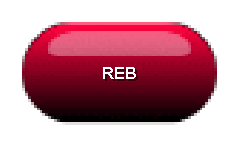
Graphical images can be used to create custom buttons.
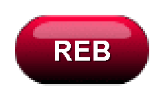
In the examples below, this image will be used for all buttons:
view layout [image %button.gif]
It appears as:
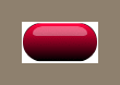
Notice that the image does not need to contain text; it's your choice. The text can be supplied later by REBOL, allowing you to reuse the button multiple times without reloading it.
The IMAGE style will act like a button when it is followed by an action block. When the image is clicked with the mouse, the action will occur.
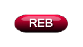
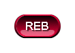
In the example below, an action is provided that browses a web site. In addition, the string "REB" is provided and will be drawn on top of the button image.
view layout [
    backcolor white
    image "REB" %button.gif [browse https://www.rebol.com]
]
The result is:
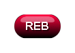
The background color for the window is set to white, because this particular button looks best on a white background.
The button is a GIF file. You can also use JPG, PNG, and BMP graphic files. Be sure to remember the % in front of the file name, or an error will occur.
Adding multiple custom buttons
The above example can be extended to reuse the same button graphic image multiple times. This example creates three buttons that take you to different web sites.
view layout [
    backcolor white
    style btn image %button.gif
    btn "REB"  [browse https://www.rebol.com]
    btn "CNET" [browse http://www.cnet.com]
    btn "CNN"  [browse http://www.cnn.com]
]
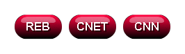
The result looks like:
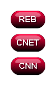
This example creates a face style called BTN which is used multiple times. This method is useful to remember. It saves typing and allows you to change the button graphic for all the buttons by just changing a single line.
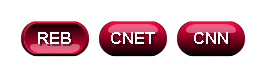
The buttons can be arranged horizontally by supplying the ACROSS keyword in the layout. Using the previous example and adding ACROSS:
view layout [
    backcolor white
    style btn image %button.gif
    across
    btn "REB"  [browse https://www.rebol.com]
    btn "CNET" [browse http://www.cnet.com]
    btn "CNN"  [browse http://www.cnn.com]
]
The result looks like:
Adding an alt-click (right click) action
You can easily add an alt-click (often called a right click, but it depends on how your mouse is configured). To do so, provide a second action block. It will be used for the alternate click. In the example below, a normal click will browse REBOL.com and an alt-click will browse REBOL.org.
view layout [
    backcolor white
    image "REB" %button.gif
        [browse https://www.rebol.com]
        [browse http://www.rebol.org]
]
The button appears the same as before, but it is sensitive to alt-click:

Changing the text attributes for a custom button
All of the the standard text font attributes can be applied to an image button. The example below shows a range of possibilities:
view layout [
    backcolor white
    style btn image %button.gif
    across
    btn "REB"
    btn "REB" italic
    btn "REB" underline
    btn "REB" font-color gold
    btn "REB" font-size 12
    btn "REB" font-name font-serif
]
The result is:
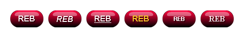
Note: To keep the example simpler, the action block is not specified. The buttons in this example don't do anything when you click on them. See above for example action blocks.
Getting the size of the button image
You may want to know the width and height of a custom button before you display it. To get the size, you can type:
graphic: load %button.gif
print graphic/size
halt
The result is:
70x38
The HALT stops the interpreter from closing the console window after it prints the size.
Changing the size of a custom button
An image button can be scaled larger without needing another image. The quality of the scaled image may vary. Some images do not scale as well.
Here is an example that uses the same image as above, but makes it smaller.
view layout [
    backcolor white
    image "REB" 80x28 %button.gif [browse https://www.rebol.com]
]
The result looks like:
Here's an example that makes the button much larger:
view layout [
    backcolor white
    image "REB" 200 %button.gif [browse https://www.rebol.com]
]
The result looks like:
Note that the entire button is scaled, including its rounded ends. However, note that the text remains the same size. To change the text, specify its new font size:
view layout [
    backcolor white
    image "REB" 200 %button.gif font-size 40
        [browse https://www.rebol.com]
]
The result looks like:
Note: Another method of extending the size of a button without affecting the ends of the button will be provided in a later release of REBOL/View.
Another way to load the button image
The button image can be loaded before the layout is created. To do so, set the image to a variable, and refer to the variable within the layout. For example, the img variable holds the button here:
img: load %button.gif

view layout [
    backcolor white
    image "REB" img [browse https://www.rebol.com]
]

A button image can also be loaded from a web server with a line such as:
img: load http://data.rebol.com/how-to/graphics/button.gif
To load the image from the web, but cache a local copy to make loading faster on subsequent requests:
img: load-thru/binary http://data.rebol.com/how-to/graphics/button.gif
Don't forget the /binary refinement.
Showing an alternate button image on a click
You can change the button's image when its clicked. To do so, load an alternate image for the button. For example, you might have image and an alternate image that look like:
view layout [
    image %button.gif
    image %button2.gif
]
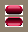
The first image is normally displayed. When the button is pressed, the second image is displayed. To do this, create a custom REDRAW function within the feel of the image face. Here is an example. The two images are loaded and referred to as the img1 and img2 variables.
img1: load %button.gif
img2: load %button2.gif

view layout [
    backcolor white
    image "REB" img1 feel [
        redraw: func [face act pos] [
            face/image: either face/state [img2][img1]
        ]
    ][
        browse https://www.rebol.com
    ]
]
The redraw function above is called immediately before the button is rendered. The image that is used for the button depends on the state of the button, up or down.
So, the button looks the same, until it is clicked.

When the button is clicked, the alternate image will be shown:
If you're going to use this button more than once, you can create a stylesheet to specify the button's redraw function. Now the button can be easily specified in the layout without repeating the redraw function each time.
img-styles: stylize [
    btn: image img1 feel [
        redraw: func [face act pos] [
            face/image: either face/state [img2][img1]
        ]
    ]
]

view layout [
    backcolor white
    styles img-styles
    across
    btn "REB"  [browse https://www.rebol.com]
    btn "CNET" [browse http://www.cnet.com]
    btn "CNN"  [browse http://www.cnn.com]
]
When each button is clicked, an alternate image will be shown.